Spatial Bias (Audit & Mitigation)
This module audits binary outputs for spatial bias and optionally mitigates it using post-processing (by flipping the original output).
Spatial bias can appear when some regions are treated more favorably or less favorably than others—for example, when a model predicts the positive class more often (or achieves higher recall) in certain areas than elsewhere, beyond what we would expect from randomness or small sample sizes.
The pipeline supports two fairness notions:
-
Statistical Parity (PR): the positive rate should be similar inside vs. outside each region.
-
Equal Opportunity (TPR): the true positive rate (recall) should be similar inside vs. outside each region.
When using Equal Opportunity, the analysis is applied on the subset of actual positives.
Quickstart
You can run the tool in three modes:
-
Audit (Detection): measures spatial bias and highlights which regions deviate.
-
Mitigation (Relabeling): flips a limited number of labels to miitgate bias.
-
Mitigation (Decision Boundary Adjustment): learns a different decision threshold per region to reduce bias and generalize to new data.
Minimum inputs by mode:
-
Audit / Relabeling:
-
binary prediction
-
region ids where each instance belongs to
-
optionally latitude + longtitude per instance
-
optionally region polygons
-
-
Decision Boundary Adjustment:
-
same as above, plus predicted probability.
-
Pipeline overview
The tool runs in the following stages:
-
Read inputs and map fields: reads predictions, optional ground truth labels, and spatial information (coordinates and/or region identifiers).
-
Build or use regions:
-
If region_ids are provided, they are used directly.
-
If region polygons are provided, points are assigned to polygons based on coordinates.
-
If neither is provided, regions may be inferred from coordinates (see the fallback table at the end).
-
-
Based on the selected mode (audit / mitigation):
-
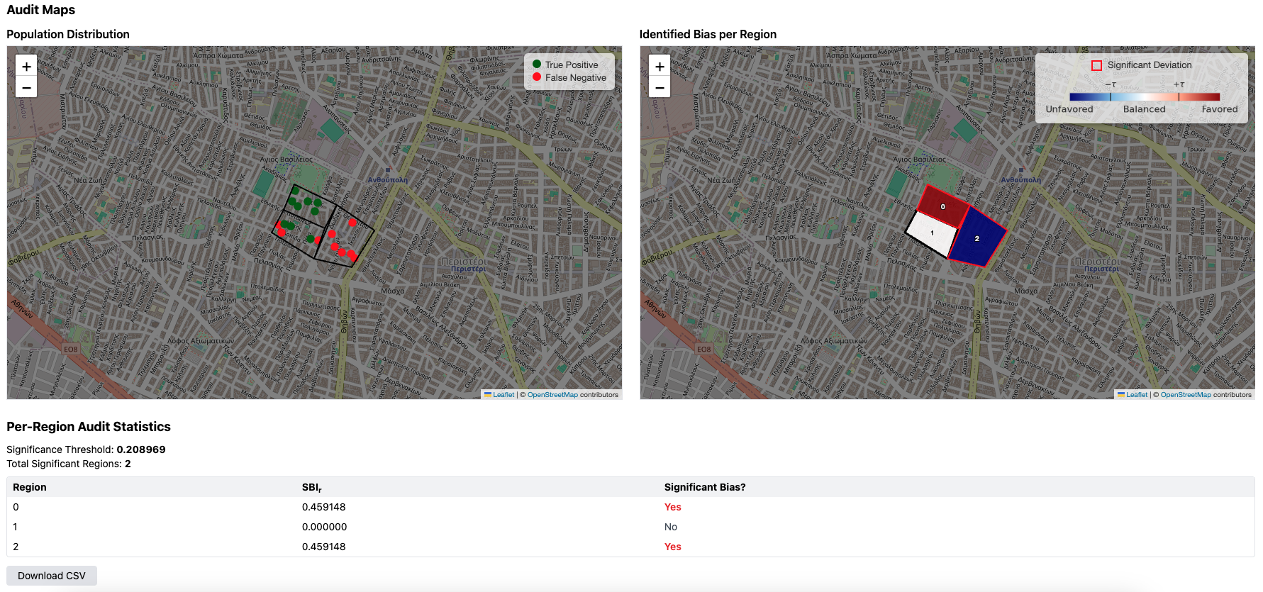
Audit: computes per-region bias scores, runs statistical testing to identify strong deviations, and produces maps and tables.
-
Mitigation: applies one of the mitigation strategies and re-runs the audit to show before/after results.
-
Audit
The "Audit" mode audits for spatial bias using statistical tests and quantifies it using the Spatial Bias Index (SBI).
Audit input format

A .csv containing instance records.
y_pred,lat,lon,y_true,region_ids
1,37.98,23.72,1,0
Mitigation: Relabeling
The "Mitigation (relabeling)" mode flips a limited number of predictions to mitigate spatial bias while controlling changes to overall outcomes.
Mitigation (relabeling) input format
A .csv containing instance records.
y_pred,lat,lon,y_true,region_ids
1,37.98,23.72,1,0
Relabel configuration

-
Fairness Notion: Statistical Parity (positive rate) or Equal Opportunity (true positive rate)
-
Alternate Worlds: number of Monte Carlo samples
-
Significance Level: confidence threshold for statistical tests
-
Budget Constraint: maximum flips allowed
-
Positive Rate Change Tolerance: maximum deviation from original positive rate
-
Approximate Solution: enable approximation
-
Work Limit: limits computational work (approximately one second of computation per unit on a single thread)
Outputs
-
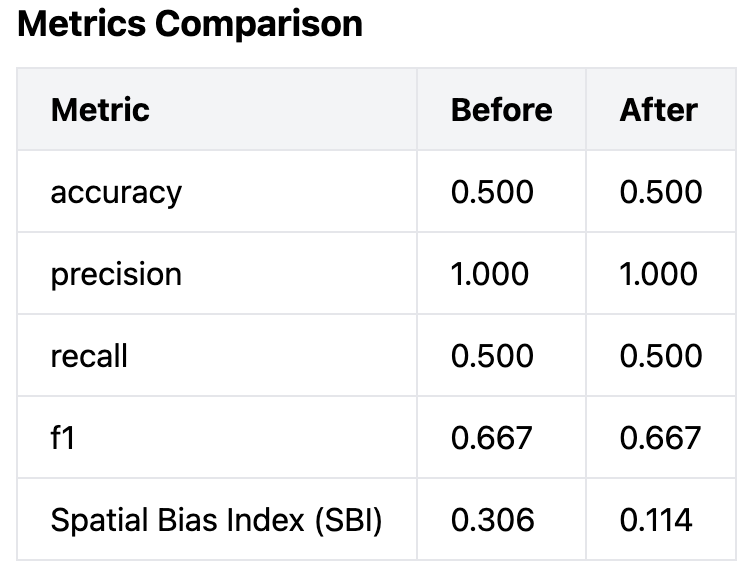
Pre/post performance metrics (Accuracy/Precision/Recall/F1/SBI)
-
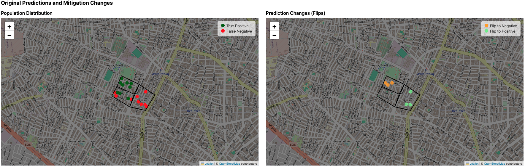
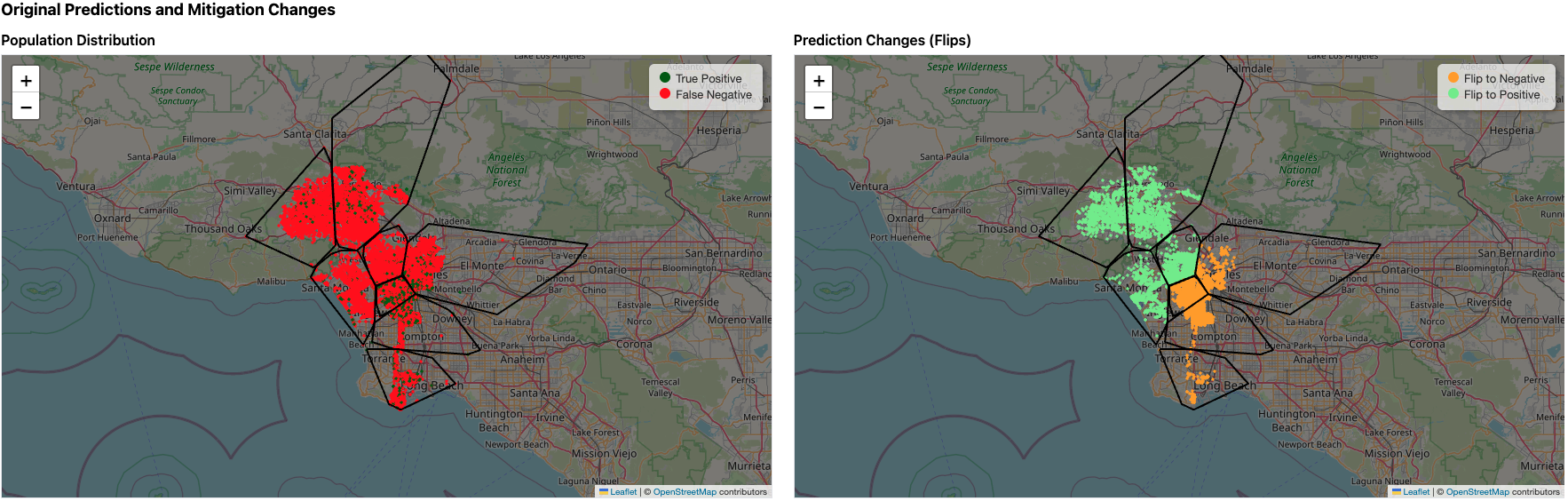
Population distribution map
-
Flip map displaying points with label changes, colored by flip direction.
-
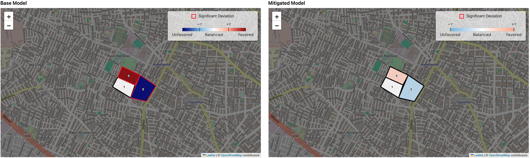
Pre/post bias per region heatmap (favored/unfavored/balanced)
-
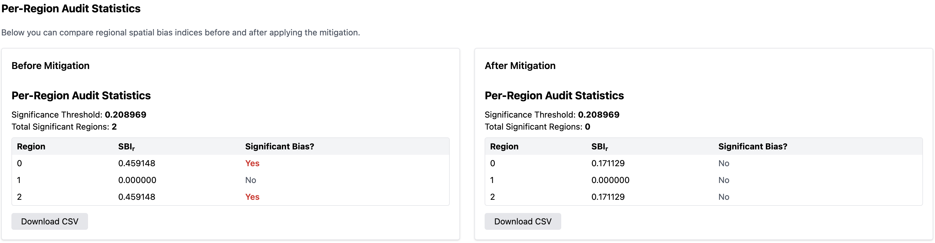
Pre/post summary statistics, biased region count
-
Pre/post per-region table (SBI + significance), downloadable

-
Mitigated predictions, downloadable
Mitigation: Decision Boundary Adjustment
The "Mitigation (Decision Boundary Adjustment)" mode learns per-region decision thresholds (instead of a single global threshold) to mitigate spatial bias and generalize to new instances.
Mitigation (Decision Boundary Adjustment) input format

A .csv containing instance records.
y_pred,y_pred_prob,lat,lon,y_true,region_ids
1,0.8,37.98,23.72,1,0
Decision Boundary Adjustment configuration
-
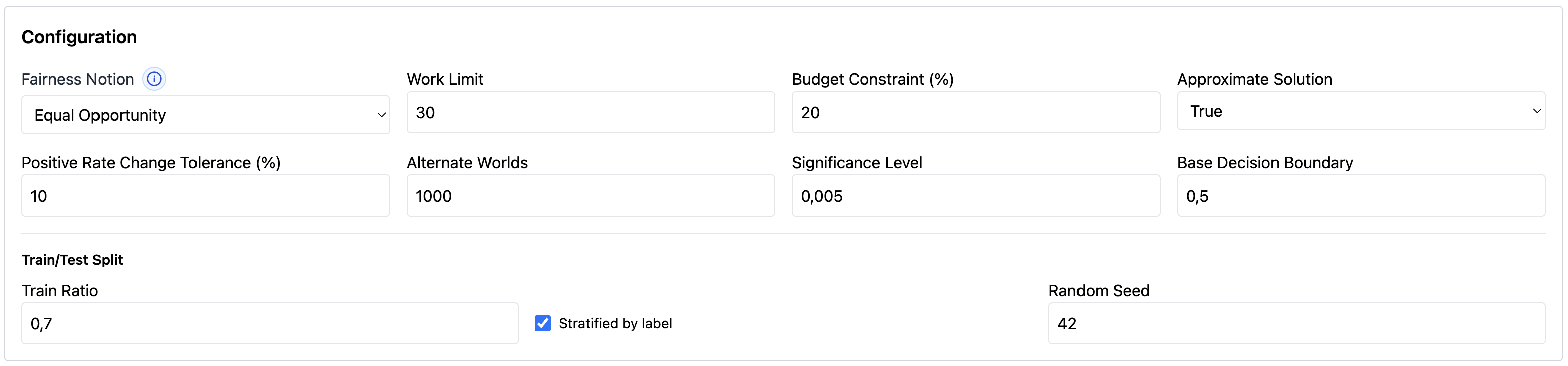
Fairness Notion: Statistical Parity (positive rate) or Equal Opportunity (true positive rate)
-
Alternate Worlds: number of Monte Carlo samples
-
Significance Level: confidence threshold for statistical tests
-
Budget Constraint: maximum flips allowed
-
Positive Rate Change Tolerance: maximum deviation from original positive rate
-
Approximate Solution: enable approximation
-
Work Limit: limits computational work (approximately one second of computation per unit on a single thread)
-
Base Model Threshold: original model threshold (e.g.,
0.5) -
Train Ratio: Proportion of data used for training when learning regional thresholds (e.g.,
0.7). -
Stratified by Label: If enabled, preserves the label distribution when splitting data into train and test sets.
-
Random Seed: Seed used to make data splitting and optimization reproducible.
Outputs
-
Pre/post performance metrics (Accuracy/Precision/Recall/F1/SBI)
-
Population distribution map
-
Flip map displaying points with label changes, colored by flip direction.
-
Pre/post bias per region heatmap (favored/unfavored/balanced)
-
Pre/post summary statistics, biased region count
-
Pre/post per-region table (SBI + significance), downloadable
-
Mitigated predictions, downloadable
-
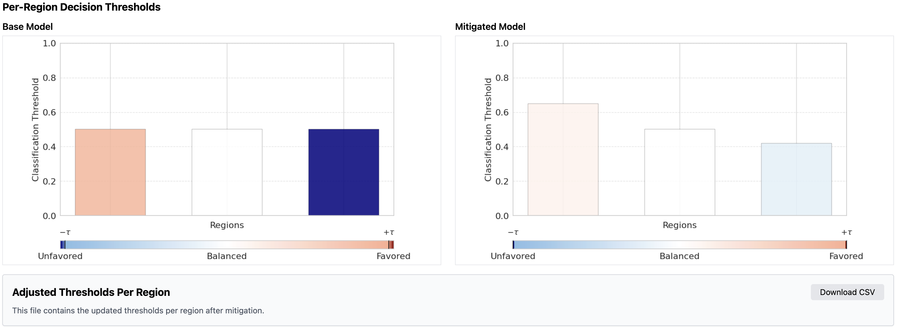
Per-region threshold plot with bias-based coloring (pre/post)
-
Adjusted thresholds table (includes tie-breaking probability if used), downloadable
Concepts: bias score, significance, and how to read the heatmap
What bias score do we report?
To quantify bias the tool uses the Spatial Bias Index (SBI), a likelihood-based unfairness score, that lies in [0,1]:
-
0 → balanced (the region behaves similarly to the rest of the territory)
-
1 → maximum deviation (extreme deviation between inside and outside behavior)
A single territory-level bias number, noted as SBI, is also reported by averaging the region scores over all audit regions.
Why do we also report “significant deviation”?
Small regions can show large differences just because they contain few observations. To avoid over-interpreting noise, the tool estimates a significance threshold using Monte Carlo simulation (“alternate worlds”):
-
It simulates many outcomes consistent with the overall behavior.
-
It then marks a region as significantly deviating only when the observed deviation is unlikely under those simulated fair outcomes.
On the map, significantly deviating regions are highlighted with a red outline
How to interpret the fairness heatmap
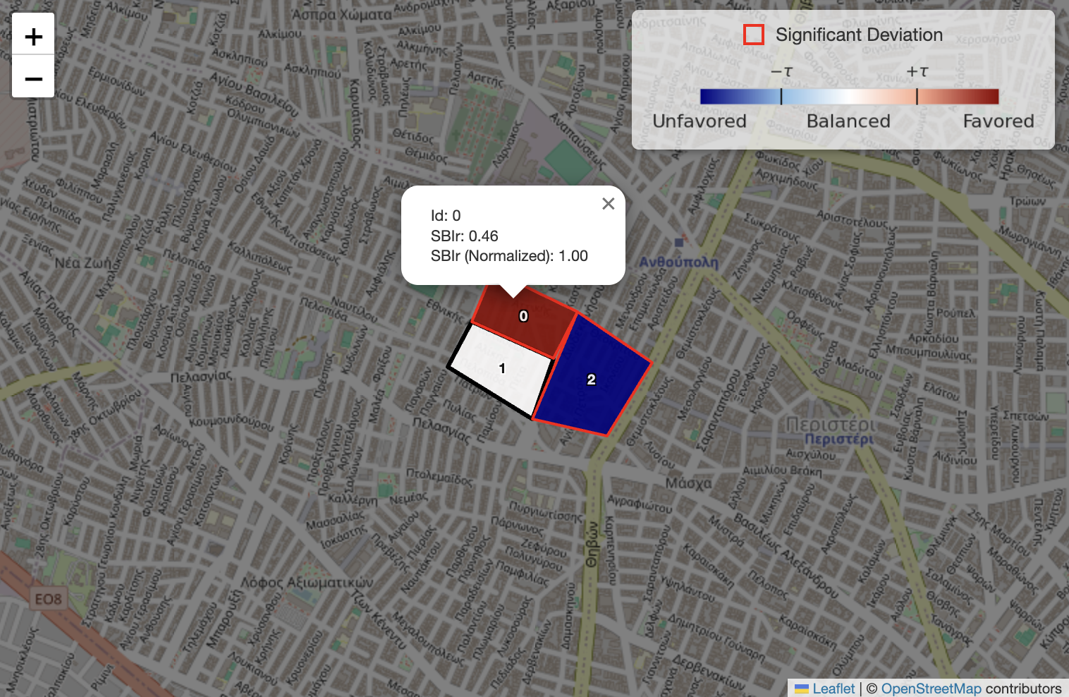
Each region is displayed:
-
with a color showing whether it is favored, balanced, or unfavored relative to the overall territory, and
-
with a red outline if it is marked as significantly deviating by the statistical test.
What does “favored” vs “unfavored” mean?
The heatmap is a diverging scale:
-
Blue → Unfavored: the region’s rate is lower than the overall rate (depending on the selected fairness target).
-
White → Balanced: the region is close to the overall rate.
-
Red → Favored: the region’s rate is higher than the overall rate.
Why is there also a “normalized map score”?
For stable coloring, the tool uses a separate map score (only for visualization) that is normalized to [-1, 1]:
-
The magnitude comes from the region bias score.
-
The sign is chosen by comparing the region’s rate to the overall rate:
-
if the region rate is higher → positive (favored)
-
if the region rate is lower → negative (unfavored)
-
This normalized map score is used only for the color scale. The numeric bias score in [0,1] remains the main quantitative indicator reported in tables.
“Fair band” (±τ) around balanced

To avoid over-interpreting tiny differences, the legend includes a tolerance band ±τ around 0:
-
If a region’s normalized score lies within [-τ, +τ], it is treated as Balanced visually.
-
Values beyond that band appear more strongly blue or red.
On the legend the ±τ markers indicate the boundary between “Balanced” and “Favored/Unfavored”.
Notes
Field Mapping
Each expected input field must be mapped to the corresponding field name as it appears in the dataset or collection.
Region Schema (Optional)

You may optionally upload a .json file describing region polygons.
Region information can be used for:
-
visualizing population and bias maps
-
computing missing region_ids by assigning points to polygons based on coordinates
[
  {
    "polygon": [
      [37.99, 23.70],
      [37.97, 23.70],
      [37.97, 23.74],
      [37.99, 23.74]
    ]
  }
]
Population visualization
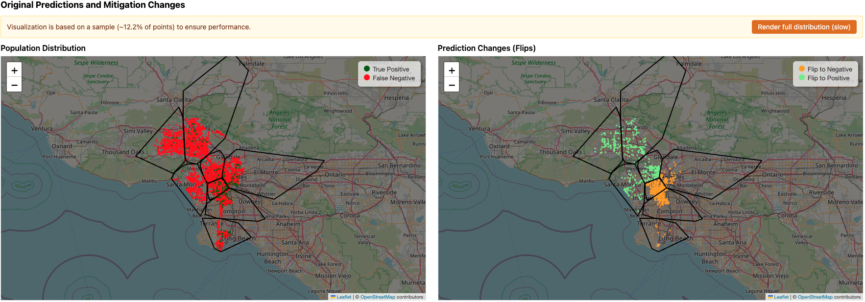
To keep the map responsive, the tool may display only a sample of points when the dataset is large (more than 10,000 instances). This sampling affects only the visualization on the map (the audit and mitigation computations still use the full dataset).
If you prefer, you can choose to render the full point distribution on the map. This may take longer to load and may be slower to interact with.
Save Mitigated Predictions
For both mitigation modes you can optionally write mitigated predictions back to the target collection by choosing the output field name.
Functionality Based on Input Availability
The behavior adapts depending on which spatial inputs are provided.
| Coordinates | Region IDs | Region Polygons | Resulting Functionality |
|---|---|---|---|
✅ |
✅ |
✅ |
Normal operation using provided coordinates, region assignments, and polygons. |
✅ |
✅ |
❌ |
Region polygons are approximated using convex hulls for visualization purposes. |
✅ |
❌ |
✅ |
Region IDs are computed by assigning instances to regions based on coordinates and polygons. |
✅ |
❌ |
❌ |
Regions are inferred by clustering instances using K-means on spatial coordinates. |
❌ |
✅ |
✅ |
Synthetic coordinates are generated inside the given polygons based on region IDs. |
❌ |
✅ |
❌ |
Synthetic regions and synthetic coordinates are generated based on region IDs. |
❌ |
❌ |
✅ |
Not supported. |
❌ |
❌ |
❌ |
Not supported. |