Model Monitoring Dashboard
The Monitoring Dashboard provides a unified interface for tracking your production model’s health, consolidating performance metrics and drift analysis into a single view.
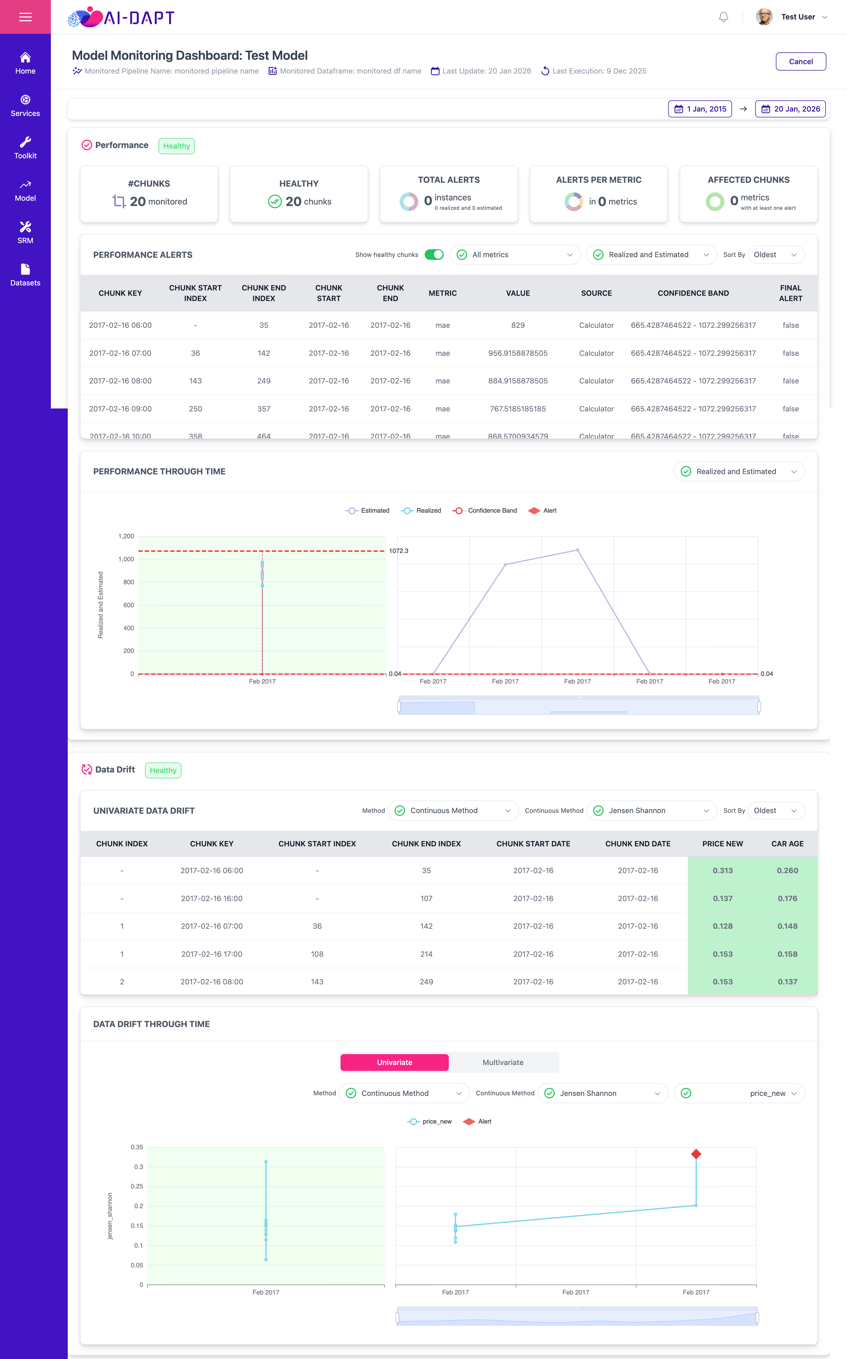
Header
The header provides immediate context regarding the data being analyzed

Monitored Pipeline |
The active pipeline deployed in production. It contains the specific version of the model currently being observed for performance stability and data integrity. |
|---|---|
Dataframe |
The production dataset containing live inference data. This dataframe includes the features used during the training phase and the resulting model predictions. |
Last Execution |
Displays the timestamp of the most recent data execution. |
From/To timestamp Filters |
Use the date picker (e.g., 1 Jan, 2015 to 20 Jan, 2026) to isolate specific time ranges for retrospective analysis. |
Performance Summary KPIs
Provides health indicators.

#CHUNKS |
Total number of chunks in monitored data frame. |
HEALTHY |
Total number of chunks in monitoring period with zero alerts for all selected metrics. |
TOTAL ALERTS |
Total alerts numbers. |
ALERTS PER METRIC |
Displays the number of unique metrics (e.g., MAE, RMSE) that have currently triggered at least one active alert. |
AFFECTED CHUNKS |
A percentage-based visual representation of overall number of chunks with at least one alert. |
Performance Alerts
The Performance Alerts section provides a detailed, tabular audit of model health across individual data chunks.
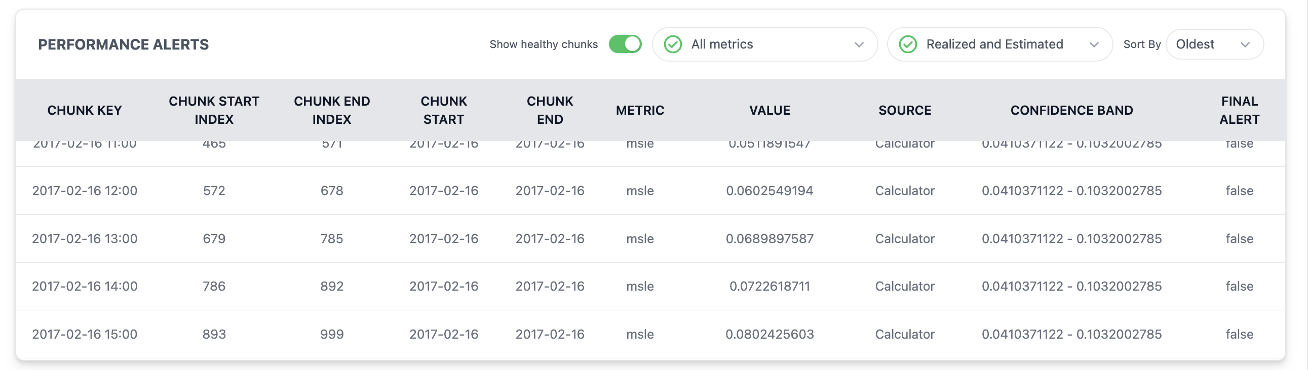
Table Controls
Before analyzing the data, use the interface controls to filter the results:
-
Show healthy chunks: Toggle this switch to filter out stable data and focus exclusively on chunks that have triggered alerts.
-
Metric Filter: Filter the table to display specific performance indicators such as MAE, RMSE, and etc.
-
Realized and Estimated: Toggle between realized performance, estimated performance or both.
-
Sort By: Reorder the data by
OldestorLatest.
Data Column Definitions
CHUNK KEY |
The unique identifier for the data (e.g., |
|---|---|
CHUNK START/END INDEX |
The specific row indices within your dataset of the chunk. |
CHUNK START/END |
The timestamps defining the beginning and end of the chunk’s monitoring period. |
METRIC |
The selected performance metric (e.g. msle). |
VALUE |
The calculated numerical result for the metric within this specific chunk. |
SOURCE |
Indicates the methodology used to calculate each selected metric’s value: Realized (derived from ground truth labels) or Estimated (derived from estimation algorithms). |
CONFIDENCE BAND |
The statistically expected range for the metric. Values outside this band typically trigger alerts. |
FINAL ALERT |
A boolean indicator ( |
Performance Through Time
The Performance Through Time visualization provides a temporal analysis of your model’s performance.
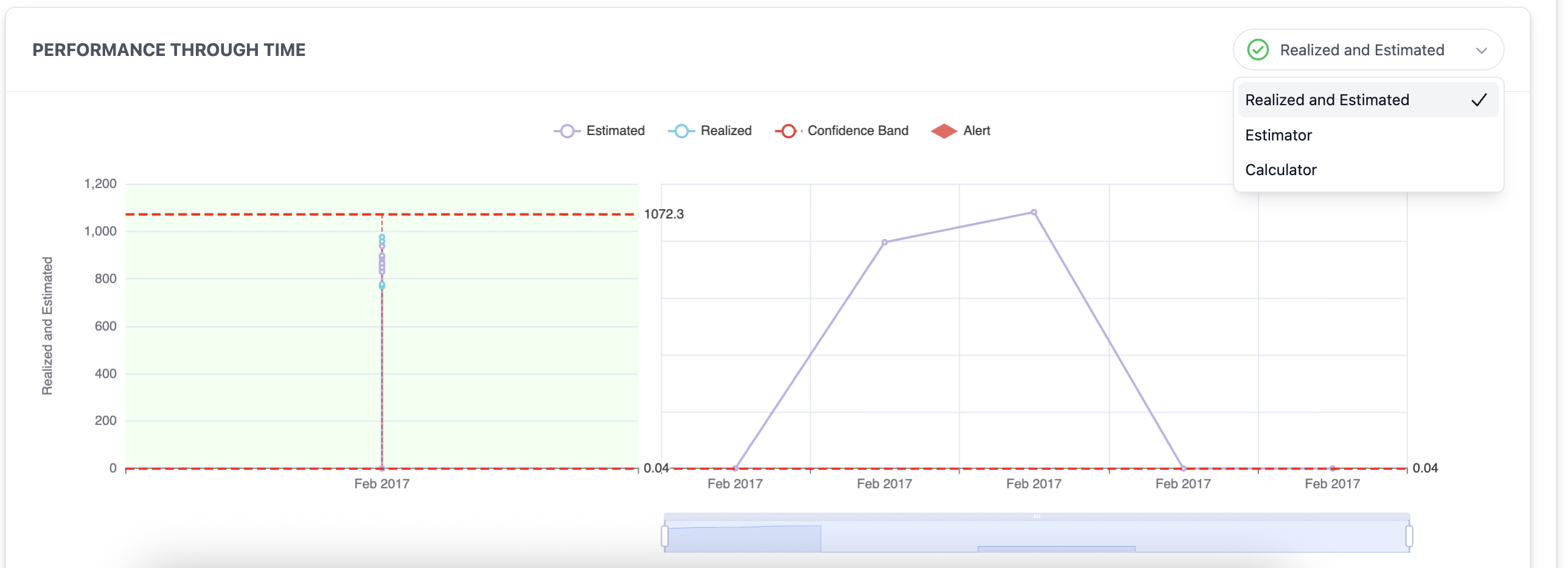
- Data Selection Toggle
-
In the top-right corner, use the dropdown menu to filter the data source for the chart:
-
Realized and Estimated: Displays both the calculations and the monitoring model’s estimations.
-
Estimator: Displays predicted model performance based on analysis of input data when ground truth is unavailable.
-
Calculator: Displays realized model performance derived from a direct comparison between model predictions and ground truth labels.
-
- Chart Legend & Elements
-
-
● Estimated: Represented by the purple line, this metric displays the predicted performance level based on analysis of input when ground truth is unavailable.
-
● Realized: Represented by the blue line, this metric displays the actual performance calculated by comparing model predictions against confirmed ground truth labels.
-
- - Confidence Band: The dashed boundary representing the Upper and Lower Threshold.
-
◆ Alert: Represented by the red diamond, this identifies specific intervals where the model’s performance has breached a defined threshold or confidence bound.
-
- Threshold Boundaries
-
The horizontal red dashed lines indicate your Critical Limits.
|
Any data point that crosses these boundaries (e.g., the |
Univariate Data Drift
Monitors the stability of individual features independently.
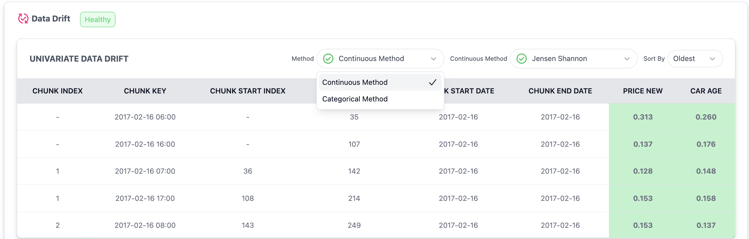
Drift Audit Controls
Use these filters to refine your data drift analysis:
-
Method Toggle: Switch between Continuous Method and Categorical Method to view the appropriate statistical tests.
-
Metric Selection: Choose the specific algorithm, such as Jensen Shannon, to visualize the magnitude of the shift.
-
Sort By: Reorder the analysis by
OldestorLatest.
Data Column Definitions
CHUNK INDEX |
The sequential number assigned to each data window processed by the system. |
|---|---|
CHUNK KEY |
The unique identifier for the data (e.g., |
CHUNK START/END INDEX |
The specific row indices within your dataset of the chunk. |
CHUNK START/END DATE |
The calendar dates defining the beginning and ending of the monitored model. |
FEATURE COLUMNS |
Individual columns for each monitored feature (e.g., |
|
Data Drift Through Time
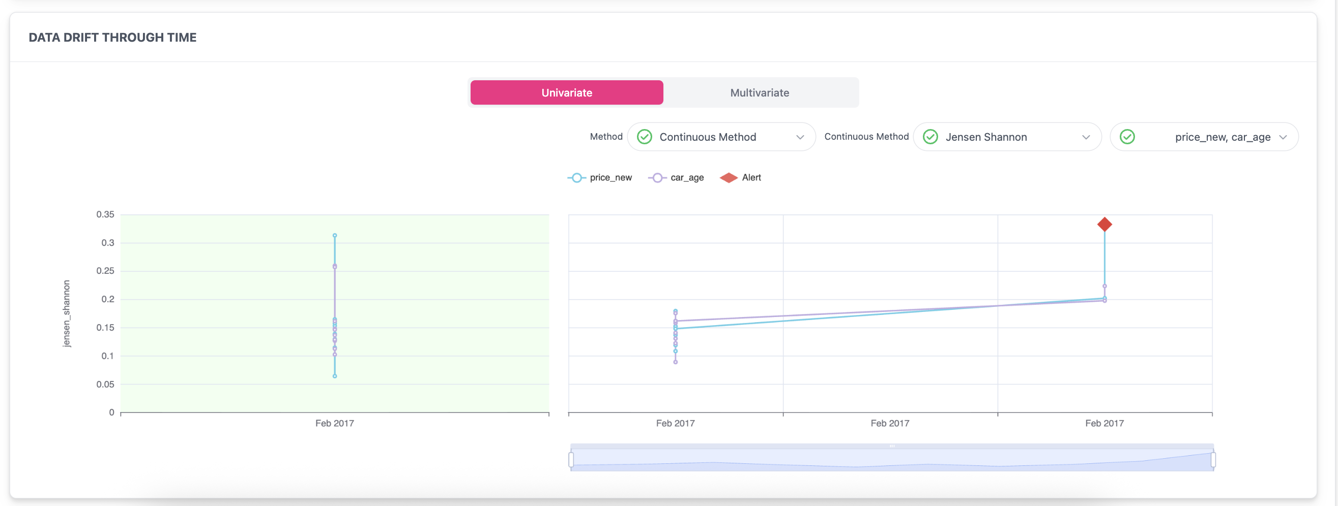
Analysis Toggles
Customize the chart view to focus on specific drift dimensions:
-
Univariate vs. Multivariate
-
Univariate: Monitors individual features independently to detect changes in their specific distributions over time.
-
Multivariate: Analyzes the collective behavior and relationships between all selected features simultaneously.
-
-
Method & Metric Selection:
-
Feature Selection: Use the column dropdown to select which specific features to display on the chart trend line.
Chart Legend & Indicators
-
● Feature A (e.g., price_new): Represented by the light blue trend line.
-
● Feature B (e.g., car_age): Represented by the purple trend line.
-
◆ Alerts:
-
Univariate Alert: Indicates that a specific feature’s distribution has statistically shifted beyond the predefined threshold.
-
Multivariate Alert: Indicates a detected shift in the joint distribution of all analyzed features.
-
Prev |